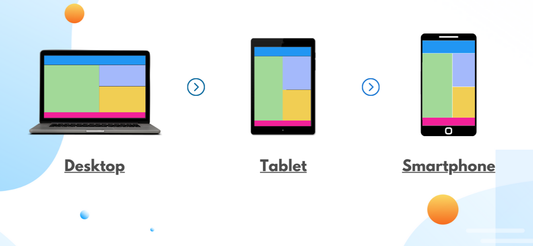
What Are CSS Media Queries? CSS media queries are rules that let your website detect the type of device or screen size being used and apply specific styles accordingly. It’s how modern websites adapt to phones, tablets, laptops, and desktops.
Step-by-Step: Basic Media Query Example Let’s create a simple webpage that changes its background color and font size on smaller screens. This is perfect for beginners.
- Create an HTML File: Save this as
index.html:
1
2
3
4
5
6
7
8
9
10
11
12
13
<!DOCTYPE html>
<html lang="en">
<head>
    <meta charset="UTF-8">
    <meta name="viewport" content="width=device-width, initial-scale=1.0">
    <title>Media Query Demo</title>
    <link rel="stylesheet" href="styles.css">
</head>
<body>
    <h1>Welcome to My Responsive Site</h1>
    <p>This page changes based on screen size.</p>
</body>
</html>- Create a CSS File: Save this as
styles.css:
1
2
3
4
5
6
7
8
9
10
11
12
13
14
/* Default styles for all screens */
body {
    background-color: white;
    font-size: 16px;
    text-align: center;
}

/* Media query for screens 768px or smaller */
@media (max-width: 768px) {
    body {
        background-color: lightgray;
        font-size: 14px;
    }
}- Test It:
- Open
index.htmlin a browser. - Resize the browser window or use developer tools (right-click > Inspect > Toggle Device Toolbar) to simulate a mobile screen (e.g., 768px or less).
- Notice the background turns light gray, and the font size shrinks.
1
2
3
4
5
6
7
/* Apply styles only when screen width is 768px or less */
@media (max-width: 768px) {
    body {
        background-color: lightgray;
        font-size: 14px;
    }
}
Why Are Media Queries Important? Today’s users access websites from various screen sizes. Media queries help ensure your site looks great and functions well everywhere. Without them, your layout may break or be hard to use on smaller screens.
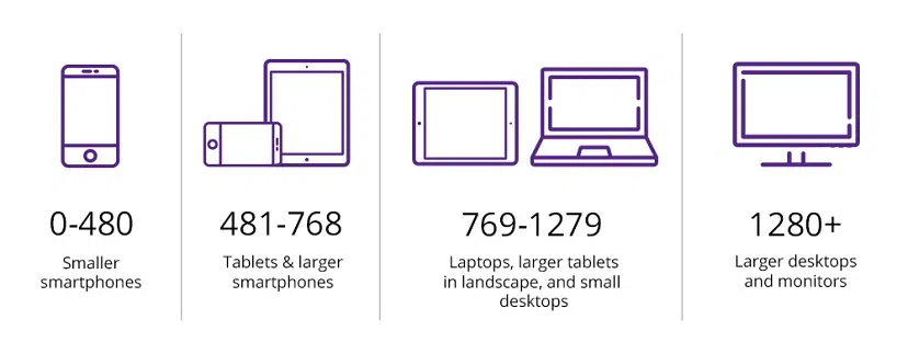
Common Breakpoints to Use: While you can customize breakpoints based on your needs, here are some commonly used ones:
- max-width: 480px (Mobile phones)
- max-width: 768px (Tablets)
- max-width: 1024px (Small laptops)
- min-width: 1200px (Large screens)
How to Write Media Queries: Media queries use logical expressions to apply styles only if conditions are true. You can check screen width, orientation, resolution, and more. Below are different ways to use media queries with step-by-step examples.
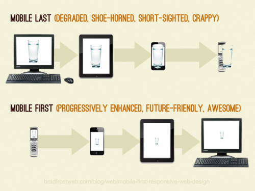
Example 1: Mobile-First Approach with Min-Width The mobile-first approach starts with base styles for smaller screens and progressively adds styles for larger screens using min-width.
- Update Your CSS: Modify
styles.cssto use a mobile-first approach:
1
2
3
4
5
6
7
8
9
10
11
12
13
14
/* Base styles for mobile */
body {
    background-color: lightyellow;
    font-size: 14px;
    text-align: center;
}

/* Styles for larger screens */
@media (min-width: 768px) {
    body {
        background-color: white;
        font-size: 16px;
    }
}- Test It:
- Open
index.htmlin a browser. - Resize the window or use developer tools to simulate a tablet or desktop (768px or wider).
- The background should change to white, and the font size should increase.
Example 2: Combining Conditions You can combine conditions like width and orientation for more specific styling.
- Add to Your CSS: Update
styles.csswith:
1
2
3
4
5
6
7
/* Styles for tablets in landscape mode */
@media (min-width: 768px) and (orientation: landscape) {
    body {
        background-color: lightgreen;
        font-size: 18px;
    }
}- Test It:
- Open
index.htmlin a browser. - Use developer tools to simulate a tablet (e.g., 768px) in landscape orientation.
- The background should turn light green, and the font size should increase.
Example 3: Media Types Media queries can target different media types like screen, print, or all.
- Add Print Styles: Update
styles.cssto style the page differently when printed:
1
2
3
4
5
6
7
8
9
10
11
/* Styles for printing */
@media print {
    body {
        background-color: white;
        color: black;
        font-size: 12pt;
    }
    h1, p {
        color: black;
    }
}- Test It:
- Open
index.htmlin a browser. - Use the browser’s print preview (File > Print or Ctrl+P).
- The page should have a white background, black text, and a 12pt font size.
Example 4: Feature Queries Use @supports to check if a browser supports a CSS feature, like display: flex.
- Add to Your HTML: Update
index.htmlto include a flex container:
1
2
3
4
5
6
7
8
9
10
11
12
13
14
15
16
17
<!DOCTYPE html>
<html lang="en">
<head>
    <meta charset="UTF-8">
    <meta name="viewport" content="width=device-width, initial-scale=1.0">
    <title>Media Query Demo</title>
    <link rel="stylesheet" href="styles.css">
</head>
<body>
    <h1>Welcome to My Responsive Site</h1>
    <div class="container">
        <div class="item">Item 1</div>
        <div class="item">Item 2</div>
        <div class="item">Item 3</div>
    </div>
</body>
</html>- Add Feature Query: Update
styles.csswith:
1
2
3
4
5
6
7
8
9
10
11
12
13
14
15
16
17
/* Default styles */
.container {
    display: block;
}
.item {
    background-color: lightblue;
    margin: 10px;
    padding: 10px;
}

/* Apply flexbox if supported */
@supports (display: flex) {
    .container {
        display: flex;
        justify-content: space-around;
    }
}- Test It:
- Open
index.htmlin a modern browser (e.g., Chrome, Firefox) that supports flexbox. - The items should display in a row, spaced evenly.
- Test in an older browser (if available) to see the fallback block layout.
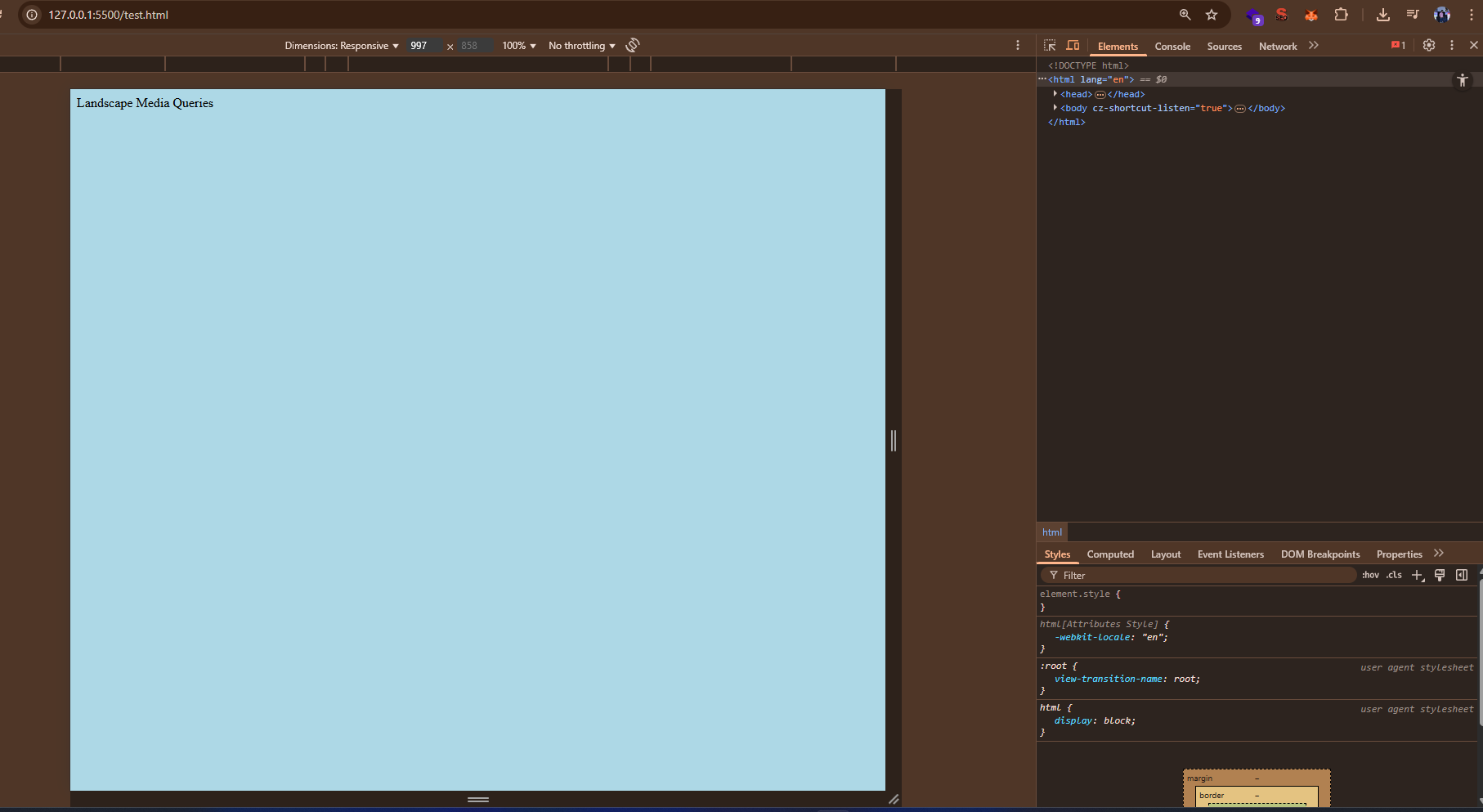
Using Developer Tools to Test Media Queries
You can use browser developer tools to test how your media queries work across different screen sizes. Here’s how:
- Open Developer Tools:
- Right-click anywhere on your webpage and select "Inspect".
- Toggle Device Toolbar:
- In the developer tools, click the device icon (a rectangle and phone) to enter responsive mode.
- Resize the viewport or select a device preset (e.g., iPhone, iPad) to test your media queries.
- Watch how your styles change as the screen size adjusts.
Best Practices for Media Queries
- Use mobile-first design: Start with base styles for small screens, then add media queries for larger devices.
- Keep breakpoints meaningful based on content layout, not specific devices.
- Avoid too many breakpoints — test with real devices or emulator tools.
- Group related queries together to improve readability.
Common Pitfalls to Avoid
- Don’t hardcode device widths—new devices come out frequently.
- Avoid relying solely on breakpoints to fix layout issues. Structure your HTML and CSS for flexibility.
- Use "em" or "rem" units instead of pixels for scalable and accessible design.
Final Thoughts: Media queries are essential for creating modern responsive designs. Practice by building layouts and testing across different screen sizes. The more you use them, the more intuitive they become.